Chapter 13 Visualization
I describe a few plotting paradigms in R and Python below. Note that these descriptions are brief. More details could easily turn any of these subsections into an entire textbook.
13.1 Base R Plotting
R comes with some built-in plotting functions such as plot(), hist() and boxplot(). Many of these reside in package:graphics, which comes pre-loaded into the search path. plot() on the other hand, is higher up the search path in package:base–it is a generic method whose methods can reside in many places (e.g. in package:graphics or some place else).
Base plotting will usually cover most of your needs, so that is what we spend the most time learning about. However, there are a large number of third-party libraries for plotting that you might consider looking into if you want to use a certain aesthetic, or if you want plotting functionality that is specialized for certain cases (e.g. geospatial plots).
Recall our Albemarle Real Estate data set (Albemarle County Geographic Data Services Office 2021) (Ford 2016).
df <- read.csv("data/albemarle_real_estate.csv")
str(df, strict.width = "cut")
## 'data.frame':    30381 obs. of  12 variables:
##  $ YearBuilt    : int  1769 1818 2004 2006 2004 1995 1900 1960 ..
##  $ YearRemodeled: int  1988 1991 NA NA NA NA NA NA NA NA ...
##  $ Condition    : chr  "Average" "Average" "Average" "Average" ..
##  $ NumStories   : num  1.7 2 1 1 1.5 2.3 2 1 1 1 ...
##  $ FinSqFt      : int  5216 5160 1512 2019 1950 2579 1530 800 9..
##  $ Bedroom      : int  4 6 3 3 3 3 4 2 2 2 ...
##  $ FullBath     : int  3 4 2 3 3 2 1 1 1 1 ...
##  $ HalfBath     : int  0 1 1 0 0 1 0 0 0 0 ...
##  $ TotalRooms   : int  8 11 9 10 8 8 6 4 4 4 ...
##  $ LotSize      : num  5.1 453.9 42.6 5 5.5 ...
##  $ TotalValue   : num  1096600 2978600 677800 453200 389200 ...
##  $ City         : chr  "CROZET" "CROZET" "CROZET" "CROZET" ...
If we wanted to get a general idea of how expensive homes were in Albemarle County, we could use a histogram. This helps us visualize a univariate numerical variable/column. Below I plot the (natural) logarithm of home prices.
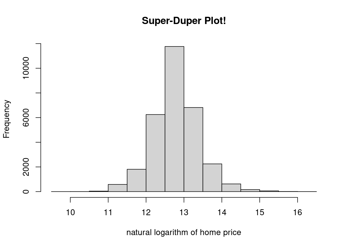
Figure 13.1: A Simple Histogram
I specified the xlab= and main= arguments, but there are many more that could be tweaked. Make sure to skim the options in the documentation (?hist).
plot() is useful for plotting two univariate numerical variables. This can be done in time series plots (variable versus time) and scatter plots (one variable versus another).
par(mfrow=c(1,2))
plot(df$TotalValue, df$LotSize,
     xlab = "total value ($)", ylab = "lot size (sq. ft.)",
     pch = 3, col = "red", type = "b")
plot(log(df$TotalValue), log(df$LotSize),
     xlab = "log. total value", ylab = "log. lot size",
     pch = 2, col = "blue", type = "p")
abline(h = log(mean(df$LotSize)), col = "green")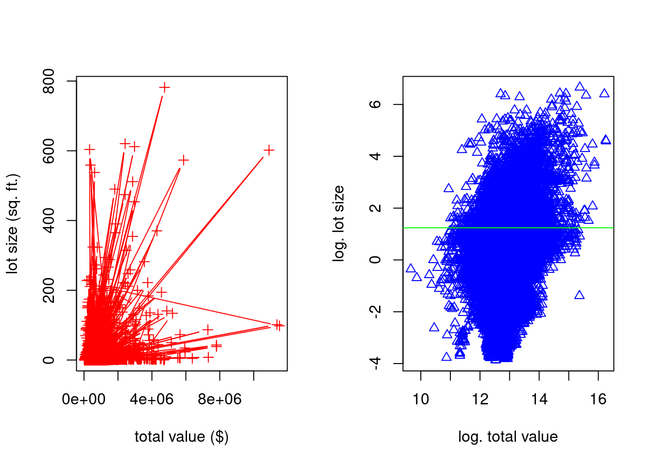
Figure 13.2: Some Scatterplots
I use some of the many arguments available (type ?plot). xlab= and ylab= specify the x- and y-axis labels, respectively. col= is short for “color.” pch= is short for “point character.” Changing this will change the symbol shapes used for each point. type= is more general than that, but it is related. I typically use it to specify whether or not I want the points connected with lines.
I use a couple other functions in the above code. abline() is used to superimpose lines over the top of a plot. They can be horizontal, vertical, or you can specify them in slope-intercept form, or by providing a linear model object. I also used par() to set a graphical parameter. The graphical parameter par()$mfrow sets the layout of a multiple plot visualization. I then set it back to the standard \(1 \times 1\) layout afterwards.
13.2 Plotting with ggplot2
ggplot2 is a popular third-party visualization package for R. There are also libraries in Python (e.g. plotnine) that have a similar look and feel. This subsection provides a short tutorial on how to use ggplot2 in R, and it is primarily based off of the material provided in (Wickham 2016). Other excellent descriptions of ggplot2 are (Kabacoff 2015) and (Chang 2013).
ggplot2 code looks a lot different than the code in the above section21. There, we would write a series of function calls, and each would change some state in the current figure. Here, we call different ggplot2 functions that create S3 objects with special behavior (more information about S3 objects in subsection 14.2.2), and then we “add” (i.e. we use the + operator) them together.
This new design is not to encourage you to think about S3 object-oriented systems. Rather, it is to get you thinking about making visualizations using the “grammar of graphics” (Wilkinson 2005). ggplot2 makes use of its own specialized vocabulary that is taken from this book. As we get started, I will try to introduce some of this vocabulary slowly.
The core function in this library is the ggplot() function. This function initializes figures; it is the function that will take in information about which data set you want to plot, and how you want to plot it. The raw data is provided in the first argument. The second argument, mapping=, is more confusing. The argument should be constructed with the aes() function. In the parlance of ggplot2, aes() constructs an aesthetic mapping. Think of the “aesthetic mapping” as stored information that can be used later on–it “maps” data to visual properties of a figure.
Consider this first example by typing the following into your own console.
You’ll notice a few things about the code and the result produced:
No geometric shapes show up!
A Cartesian coordinate system is displayed, and the x-axis and y-axis were created based on aesthetic mapping provided (confirm this by typing
summary(mpg$displ)andsummary(mpg$hwy)).The axis labels are taken from the column names provided to
aes().
To display geometric shapes (aka geoms in the parlance of ggplot2), we need to add layers to the figure. “Layers” is quite a broad term–it does not only apply to geometric objects. In fact, in ggplot2, a layer can be pretty much anything: raw data, summarized data, transformed data, annotations, etc. However, the functions that add geometric object layers usually start with the prefix geom_. In RStudio, after loading ggplot2, type geom_, and then press <Tab> (autocomplete) to see some of the options.
Consider the function geom_point(). It too returns an S3 instance that has specialized behavior. In the parlance of ggplot2, it adds a scatterplot layer to the figure.
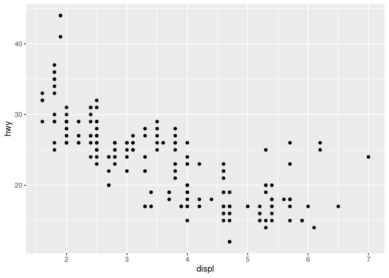
Figure 13.3: A Second Scatterplot
Notice that we did not need to provide any arguments to geom_point()–the aesthetic mappings were used by the new layer.
There are many types of layers that you can add, and you are not limited to any number of them in a given plot. For example, if we wanted to add a title, we could use the ggtitle() function to add a title layer. Unlike geom_point(), this function will need to take an argument because the desired title is not stored as an aesthetic mapping. Try running the following code on your own machine.
Additionally, notice that the same layer will behave much differently if we change the aesthetic mapping.
ggplot(mpg, aes(x = displ, y = hwy, color = manufacturer))  +
  geom_point() +
  ggtitle("my favorite scatterplot")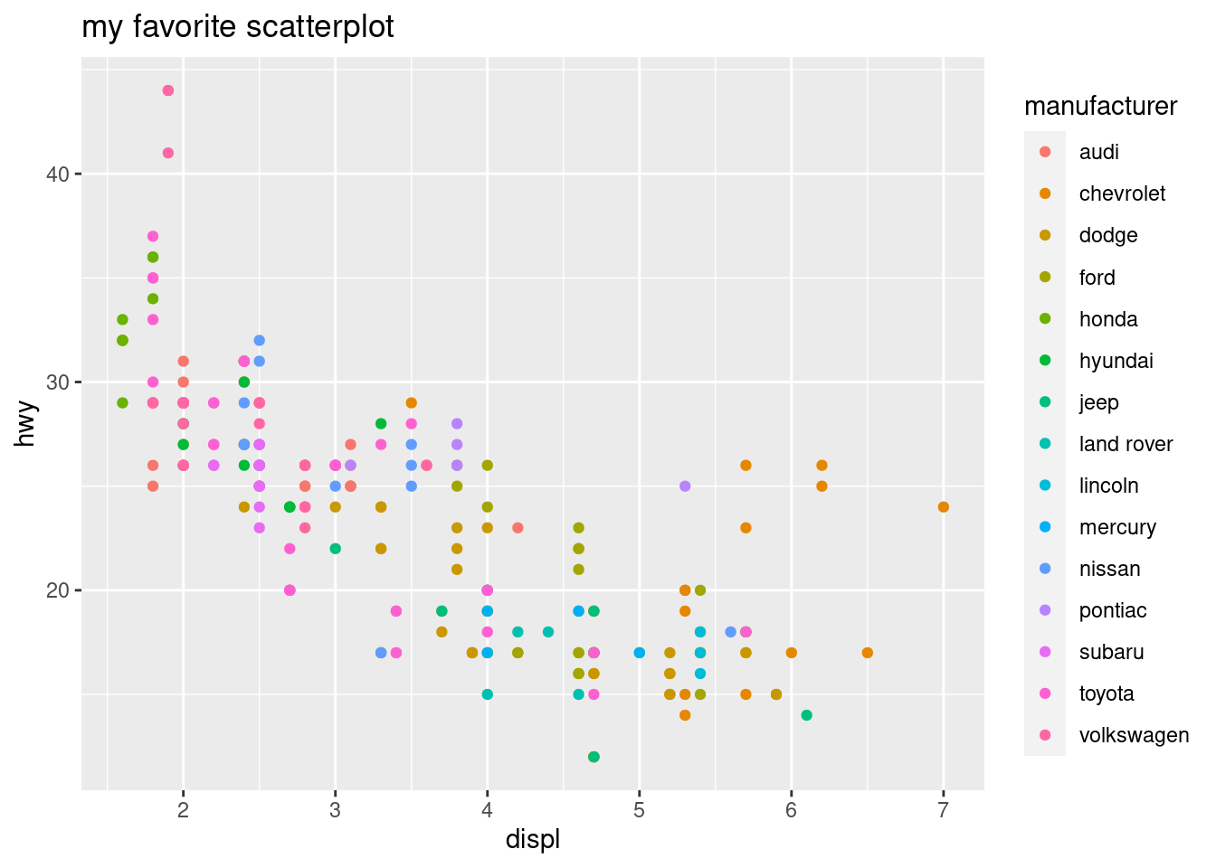
Figure 13.4: Adding Some Color
If we want tighter control on the aesthetic mapping, we can use scales. Syntactically, these are things we “add” (+) to the figure, just like layers. However, these scales are constructed with a different set of functions, many of which start with the prefix scale_. We can change attributes of the axes like this.
base_plot <- ggplot(mpg,
                    aes(x = displ, y = hwy, color = manufacturer)) +
             geom_point() +
             ggtitle("my favorite scatterplot")
base_plot + scale_x_log10() + scale_y_reverse()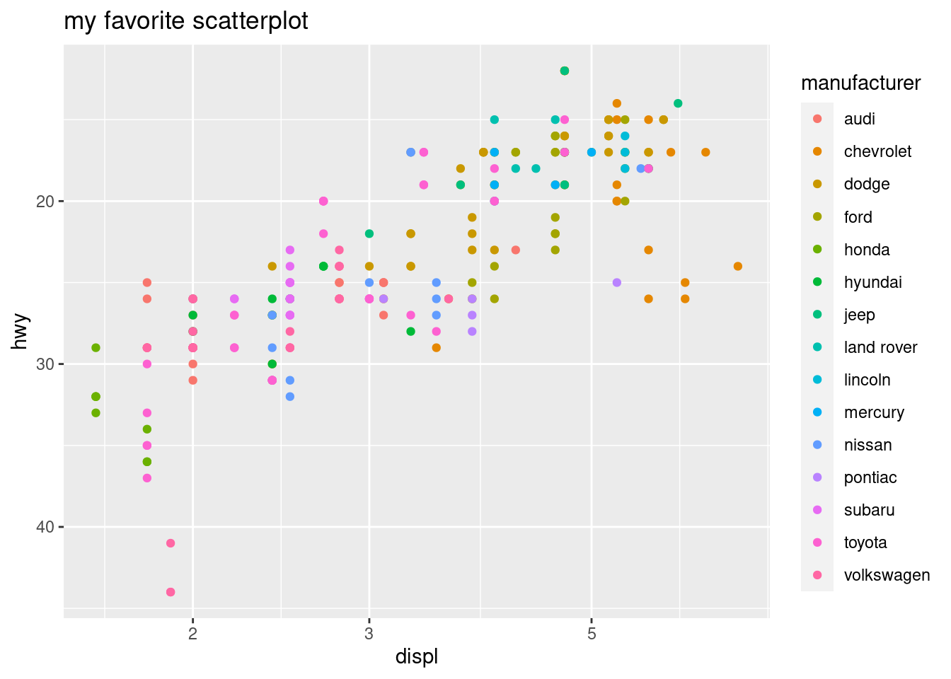
Figure 13.5: Changing Scales
We can also change plot colors with scale layers. Let’s add an aesthetic called fill= so we can use colors to denote the value of a numerical (not categorical) column. This data set doesn’t have any more unused numerical columns, so let’s create a new one called score. We also use a new geom layer from a function called geom_tile().
mpg$score <- 1/(mpg$displ^2 + mpg$hwy^2)
ggplot(mpg, aes(x = displ, y = hwy, fill = score ))  +
geom_tile() 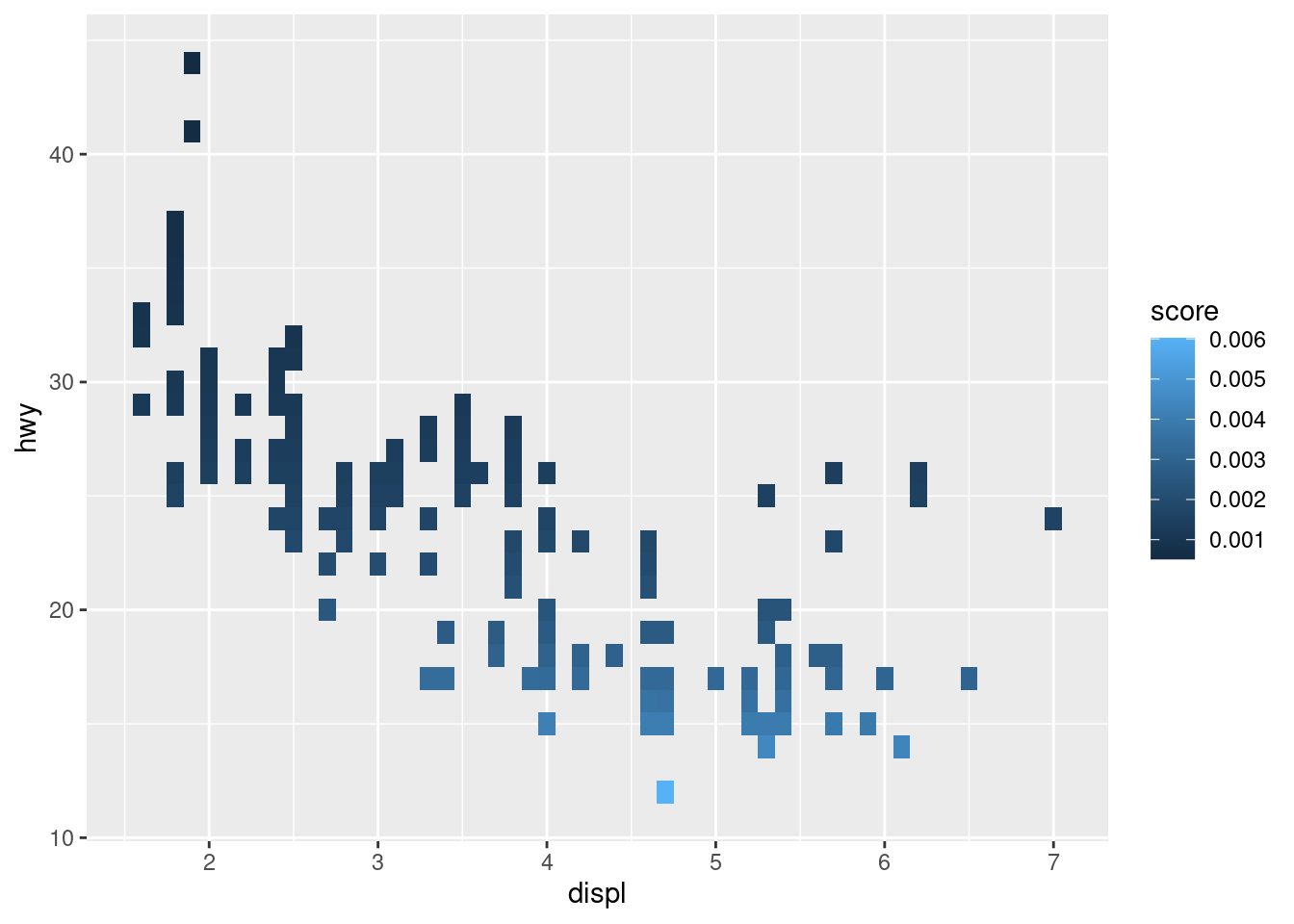
Figure 13.6: Changing the Fill
If we didn’t like these colors, we could change them with a scale layer. Personally, I like this one.
mpg$score <- 1/(mpg$displ^2 + mpg$hwy^2)
ggplot(mpg, aes(x = displ, y = hwy, fill = score ))  +
  geom_tile() +
  scale_fill_viridis_b()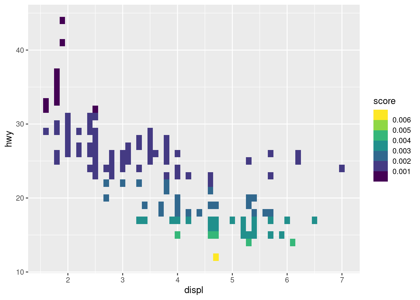
Figure 13.7: Changing the Fill Again
There are many to choose from, though. Try to run the following code on your own to see what it produces.
13.3 Plotting with Matplotlib
Matplotlib (Hunter 2007) is a third-party visualization library in Python. It is the oldest and most heavily-used, so it is the best way to start making graphics in Python, in my humble opinion. It also comes installed with Anaconda.
This short introduction borrows heavily from the myriad of tutorials on Matplotlib’s website. I will start off making a simple plot, and commenting on each line of code. If you’re interested in learning more, (VanderPlas 2016) and (McKinney 2017) are also terrific resources.
You can use either “pyplot-style” (e.g. plt.plot()) or “object-oriented-style” to make figures in Matplotlib. Even though using the first type is faster to make simple plots, I will only describe the second one. It is the recommended approach because it is more extensible. However, the first one resembles the syntax of MATLAB. If you’re familiar with MATLAB, you might consider learning a little about the first style, as well.
import matplotlib.pyplot as plt       # 1
import numpy as np                    # 2
fig, ax = plt.subplots()              # 3
_ = ax.hist(np.random.normal(size=1000))  # 4
plt.show()                            # 5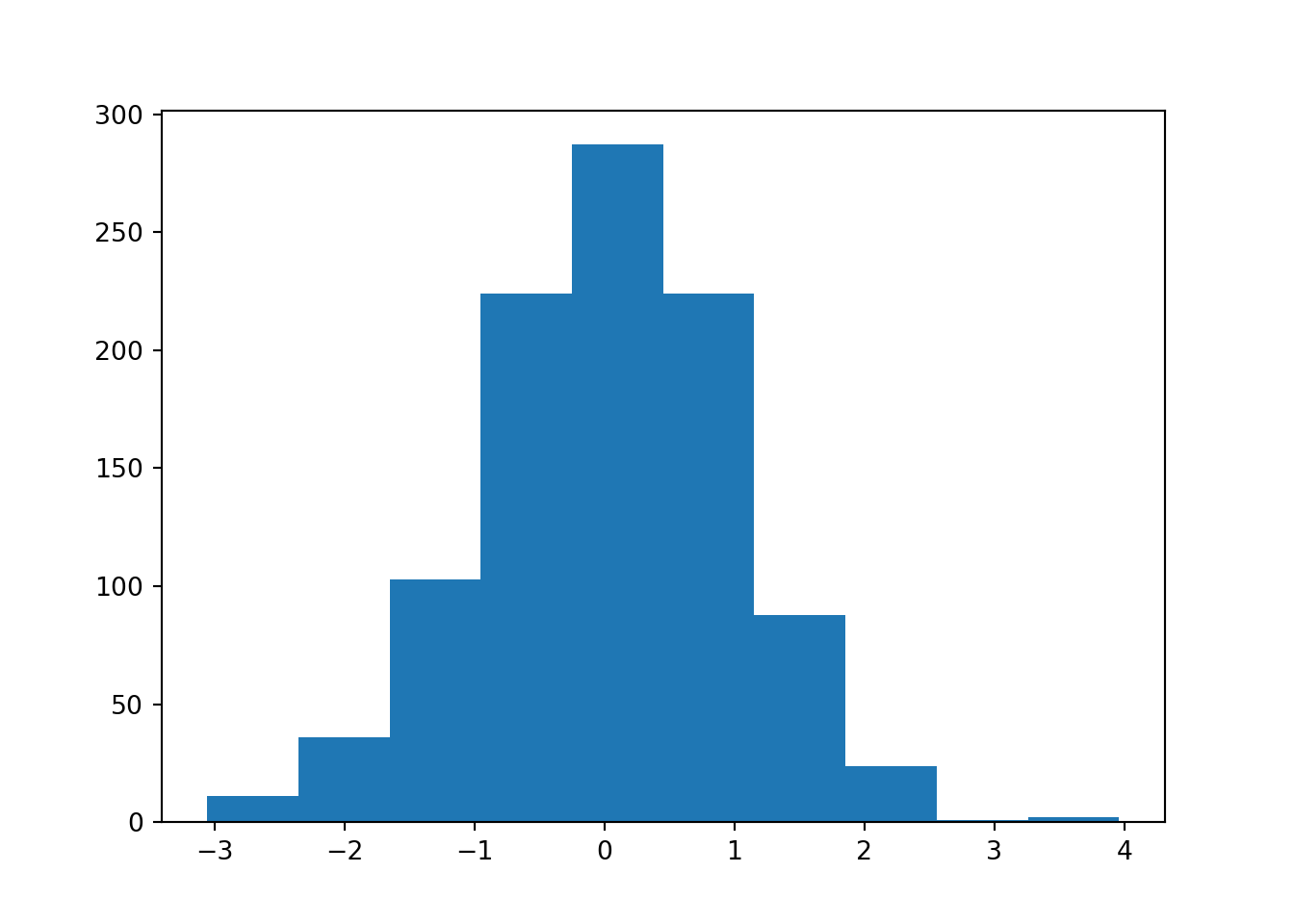
Figure 13.8: Another Simple Histogram
In the first line, we import the pyplot submodule of matplotlib. We rename it to plt, which is short, and will save us some typing. Calling it plt follows the most popular naming convention.
Second, we import Numpy in the same way we always have. Matplotlib is written to work with Numpy arrays. If you want to plot some data, and it isn’t in a Numpy array, you should convert it first.
Third, we call the subplots() function, and use sequence unpacking to unpack the returned container into individual objects without storing the overall container. “Subplots” sounds like it will make many different plots all on one figure, but if you look at the documentation the number of rows and columns defaults to one and one, respectively.
plt.subplots() returns a tuple22 of two things: a Figure object, and one or more Axes object(s). These two classes will require some explanation.
A
Figureobject is the overall visualization object you’re making. It holds onto all of the plot elements. If you want to save all of your progress (e.g. withfig.savefig('my_picture.png')), you’re saving the overallFigureobject.One or more
Axesobjects are contained in aFigureobject. Each is “what you think of as ‘a plot’.” They hold onto twoAxisobjects (in the case of 2-dimensional plots) or three (in the case of 3-dimensional arguments). We are usually calling the methods of these objects to effect changes on a plot.
In line four, we call the hist() method of the Axes object called ax. We assign the output of .hist() to a variable _. This is done to suppress the printing of the method’s output, and because this variable name is a Python convention that signals the object is temporary and will not be used later in the program. There are many more plots available than plain histograms. Each one has its own method, and you can peruse the options in the documentation.
If you want to make figures that are more elaborate, just keep calling different methods of ax. If you want to fit more subplots to the same figure, add more Axes objects. Here is an example using some code from one of the official Matplotlib tutorials.
# x values grid shared by both subplots
x = np.linspace(0, 2*np.pi, 100)

# create two subplots...one row two columns
fig, myAxes = plt.subplots(1, 2) # kind of like par(mfrow=c(1,2)) in R

# first subplot
myAxes[0].plot(x, x, label='linear')  # Plot some data on the axes.
## [<matplotlib.lines.Line2D object at 0x7f1fc9edd5c0>]
myAxes[0].plot(x, x**2, label='quadratic')  # Plot more data
## [<matplotlib.lines.Line2D object at 0x7f1fc9edd6d8>]
myAxes[0].plot(x, x**3, label='cubic')  # ... and some more.
## [<matplotlib.lines.Line2D object at 0x7f1fc9edda20>]
myAxes[0].set_xlabel('x label')  # Add an x-label to the axes.
## Text(0.5, 0, 'x label')
myAxes[0].set_ylabel('y label')  # Add a y-label to the axes.
## Text(0, 0.5, 'y label')
myAxes[0].set_title("Simple Plot")  # Add a title to the axes.
## Text(0.5, 1.0, 'Simple Plot')
myAxes[0].legend()  # Add a legend.

# second subplot
## <matplotlib.legend.Legend object at 0x7f1fc9f11e48>
myAxes[1].plot(x,np.sin(x), label='sine wave')
## [<matplotlib.lines.Line2D object at 0x7f1fc9eea7b8>]
myAxes[1].legend()
## <matplotlib.legend.Legend object at 0x7f1fc9e78128>
plt.show()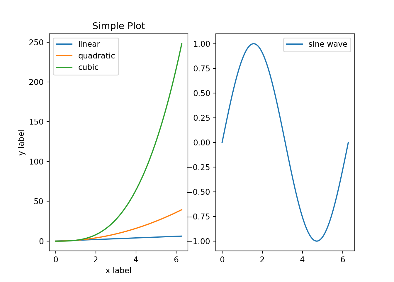
Figure 13.9: Side-By-Side Line Plots in Matplotlib
13.4 Plotting with Pandas
Pandas provides several DataFrame and Series methods that perform plotting. These methods are mostly just wrapper functions around Matplotlib code. They are written for convenience, so generally speaking, plotting can be done more quickly with Pandas compared to Matplotlib. Here I describe a few options that are available, and the documentation provides many more details for the curious reader.
The .plot() method is very all-encompassing because it allows you to choose between many different plot types: a line plot, horizontal and vertical bar plots, histograms, boxplots, density plots, area plots, pie charts, scatterplots and hexbin plots. If you only want to remember one function name for plotting in Pandas, this is it.
If you already have Pandas imported, you can make good-looking plots in just one line of code. The default plot type for .plot() is a line plot, so there tends to be less typing if you’re working with time series data.
import pandas as pd
df = pd.read_csv("data/gspc.csv")
df.head()
##         Index    GSPC.Open  ...   GSPC.Volume  GSPC.Adjusted
## 0  2007-01-03  1418.030029  ...  3.429160e+09    1416.599976
## 1  2007-01-04  1416.599976  ...  3.004460e+09    1418.339966
## 2  2007-01-05  1418.339966  ...  2.919400e+09    1409.709961
## 3  2007-01-08  1409.260010  ...  2.763340e+09    1412.839966
## 4  2007-01-09  1412.839966  ...  3.038380e+09    1412.109985
##
## [5 rows x 7 columns]
df['GSPC.Adjusted'].plot()
## <matplotlib.axes._subplots.AxesSubplot object at 0x7f1fc9e4a828>
Choosing among nondefault plot types can be done in a variety of ways. You can either use the .plot accessor data member of a DataFrame, or you can pass in different strings to .plot()’s kind= parameter. Third, some plot types (e.g. boxplots and histograms) have their own dedicated methods.
df['returns'] = df['GSPC.Adjusted'].pct_change()
df['returns'].plot(kind='hist')
# same as df['returns'].plot.hist()
# same as df['returns'].hist()
## <matplotlib.axes._subplots.AxesSubplot object at 0x7f1fc9e4a828>
There are also several freestanding plotting functions (not methods) that take in DataFrames and Series objects. Each of these functions is typically imported individually from the pandas.plotting submodule.
The following code is an example of creating a “lag plot,” which is simply a scatterplot between a time series’ lagged and nonlagged values. The primary benefit of this function over .plot() is that this function does not require you to construct an additional column of lagged values, and it comes up with good default axis labels.
13.5 Exercises
13.5.1 R Questions
The density of a particular bivariate Gaussian distribution is
\[ f(x,y) = \frac{1}{2 \pi} \exp\left[ -\frac{x ^2 + y^2}{2} \right] \tag{1}. \] The random elements \(X\) and \(Y\), in this particular case, are independent, each have unit variance, and zero mean. In this case, the marginal for \(X\) is a mean \(0\), unit variance normal distribution:
\[ g(x) = \frac{1}{\sqrt{2\pi}} \exp\left[ -\frac{x ^2 }{2} \right] \tag{2}. \]
- Generate two plots of the bivariate density. For one, use
persp(). For the other, usecontour(). - Generate a third plot of the univariate density.
Consider again the Militarized Interstate Disputes (v5.0) (Palmer et al.) data set from The Correlates of War Project. A description of this data was given in the previous chapter. Feel free to re-use the code you used in the related exercise.
- Use a scatterplot to display the relationship between the maximum duration and the end year. Plot each country as a different color.
13.5.2 Python Questions
Reproduce figure 15.1) in section 15.2.1.1 that displays the simple “spline” function. Feel free to use any of the visible code in the text.
The “4 Cs of diamonds”–or the four most important factors that explain a diamond’s price–are cut, color, clarity and carat. How does the price of diamonds vary as these three factors vary?
- Consider the data set
diamonds.csvfrom (Wickham 2016) and plot thepriceagainstcarat. - Visualize the other categorical factors simultaneously. Determine the most elegant way of visualizing all four factors at once and create a plot that does that. Determine the worst way to visualize all factors at once, and create that plot as well.
References
Albemarle County Geographic Data Services Office. 2021. “Albemarle County GIS Web.” https://www.albemarle.org/government/community-development/gis-mapping/gis-data.
Chang, Winston. 2013. R Graphics Cookbook. O’Reilly Media, Inc.
Ford, Clay. 2016. “ggplot: Files for UVA StatLab workshop, Fall 2016.” GitHub Repository. https://github.com/clayford/ggplot2; GitHub.
Hunter, J. D. 2007. “Matplotlib: A 2D Graphics Environment.” Computing in Science & Engineering 9 (3): 90–95. https://doi.org/10.1109/MCSE.2007.55.
Kabacoff, Robert I. 2015. R in Action. Second. Manning. http://www.worldcat.org/isbn/9781617291388.
McKinney, Wes. 2017. Python for Data Analysis: Data Wrangling with Pandas, Numpy, and Ipython. 2nd ed. O’Reilly Media, Inc.
Palmer, Glenn, Roseanne W McManus, Vito D’Orazio, Michael R Kenwick, Mikaela Karstens, Chase Bloch, Nick Dietrich, Kayla Kahn, Kellan Ritter, and Michael J Soules“The Mid5 Dataset, 2011–2014: Procedures, Coding Rules, and Description.” Conflict Management and Peace Science 0 (0): 0738894221995743. https://doi.org/10.1177/0738894221995743.
VanderPlas, Jake. 2016. Python Data Science Handbook: Essential Tools for Working with Data. 1st ed. O’Reilly Media, Inc.
Wickham, Hadley. 2016. Ggplot2: Elegant Graphics for Data Analysis. Springer-Verlag New York. https://ggplot2.tidyverse.org.
Wilkinson, Leland. 2005. The Grammar of Graphics (Statistics and Computing). Berlin, Heidelberg: Springer-Verlag.
Personally, I find its syntax more confusing, and so I tend to prefer base graphics. However, it is very popular, and so I do believe that it is important to mention it here in this text.↩
We didn’t talk about
tuples in chapter 2, but you can think of them as being similar tolists. They are containers that can hold elements of different types. There are a few key differences, though: they are made with parentheses (e.g.('a')) instead of square brackets, and they are immutable instead of mutable.↩